
We are digital agency that helps businesses develop immersive and engaging
We are digital agency that helps businesses develop immersive and engaging
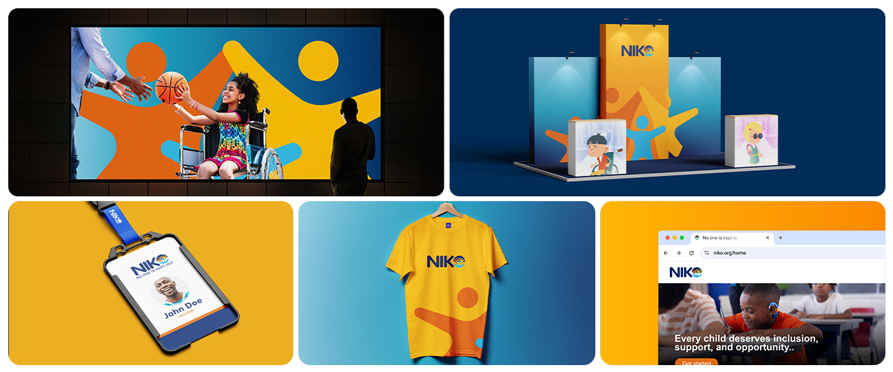
NIKO is an inclusive support brand focused on ensuring that no one is excluded from essential services, opportunities, and care. The brand identity project involved developing a warm, accessible, and empowering visual system for children with disabilities, caregivers, families, and service providers. Its main goal was to create a clear and compassionate identity that communicates dignity, visibility, belonging, and equal access while positioning NIKO as a trusted voice for community empowerment in Kenya and across Africa.
The brand needed to communicate inclusion and compassion while remaining professional, approachable, and easy to understand. The identity had to appeal to diverse audiences, including children with disabilities, caregivers, families, and service providers. It also needed to avoid feeling overly institutional by using a visual language that reflected warmth, hope, collaboration, and empowerment.
A human-centred brand identity was developed around the values of inclusion, compassion, empowerment, collaboration, and innovation. The visual direction combines a confident blue foundation with warm accent colours to express trust, optimism, and approachability. Clear typography and structured layouts improve readability and accessibility, while the messaging focuses on connection, dignity, and equal opportunity. Deliverables included the brand concept, logo direction, colour palette, typography system, brand messaging, and a project overview presentation.
The completed identity gives NIKO a clear and consistent foundation for communicating with its community and partners. It presents the organisation as warm, inclusive, credible, and purpose-driven. The brand system can be applied across digital platforms, printed materials, social media, awareness campaigns, presentations, and community programmes. No verified performance results or client feedback were available at the time of documentation.
BACK TO PROJECTS